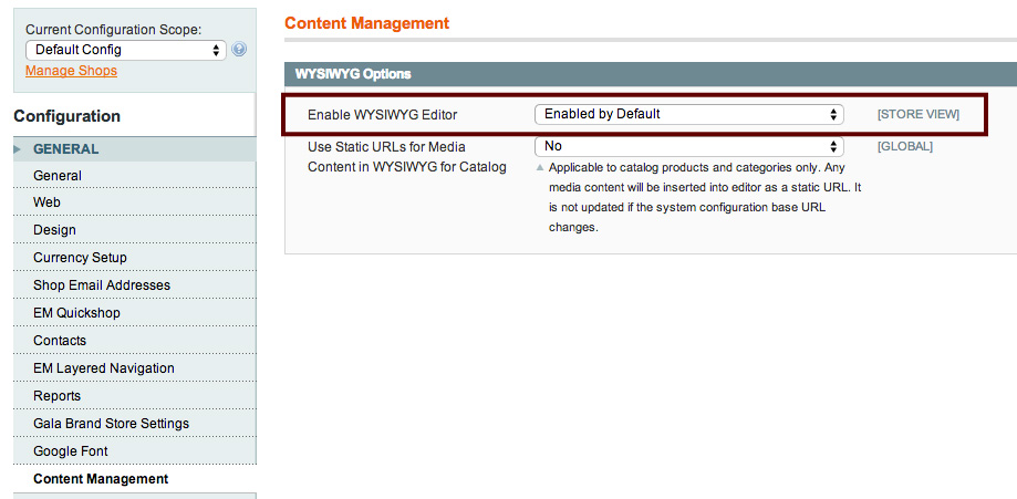
Option 1. See no evil (lazy method)
Turn off the WYSIWYG editor in Config->System->Content Management->Enable WYSIWYG Editor. Hey presto, your content won't get validated and you can get away with all sorts of naughtiness in the CMS. Pretty slack and not really an acceptable solution though...read on.
Option 2. Use inline elements instead of blocks.
This code now will save perfectly:- [php title="Wrap the anchor around inline elements only"] <a title="Take a virtual tour" href="/virtual-tour.html"> <img src="shop.png" alt="our shop" /><br /> <strong>VISIT OUR LOCAL STORE</strong><br /> <span class="primary">or click here to take a <strong>Virtual Tour</strong></span> </a> [/php] We've swapped the heading and paragraphs for inline elements like span and strong, also we need breaks to push the text on a new line. Still it feels like a fudge and we've lost the SEO perks of the heading tag.Option 3. Do it properly
[php title="Ideal Code"] <div class="call2action"> <a title="Take a virtual tour" href="/virtual-tour.html"> <img src="shop.png" alt="our shop" /> </a> <h4>VISIT OUR LOCAL STORE</h4> <p>or click here to take a <strong>Virtual Tour</strong></p> </div> [/php] First we revert back to using headings and paragraphs but only wrap the anchor tag around the image which will stop Magento corrupting our content. Then add a wrapper around everything we want clickable and create a jquery click event on any item with this class to find the first a href from within the box.$(document).ready(function() {$('body').on('click','.call2action',function(e){ //bind to body incase the block is loaded via ajax after page loade.preventDefault(); //Prevent the default action if the user clicks the A tagvar url = $(this).find('a').first().attr('href'); //Find the first href in our containerwindow.location.assign(url); //Go there});});
Now you can add as many call2action divs as you need and the javascript will trigger when any of them are clicked and jump to the right URL. Happy Days! Don't forget a lil CSS to add the cursor pointer and different hover or border colour to feedback to the user that the area is clickable. Then we can remove the pesky text decoration too:-
[css autolinks="false" collapse="false" firstline="1" gutter="true" htmlscript="true" light="false" padlinenumbers="true" title="styles.css"]
.call2action:hover { cursor:pointer; background-color:#F7F4E1; text-decoration:none;}
[/css]
Conclusion: This method can be used on any site not just Magento to create call to action content blocks which are completely clickable, with correct and SEO optimised markup. Hope this is useful for someone who's been pulling their hair out with Mage static blocks or pages.

